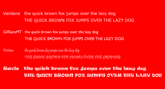
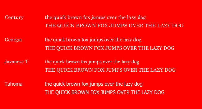
Hello there, this week we have done some cool stuff on typefaces and learned about how powerful they are to express our purpose in design environment. When you change the typeface the visual effect of the message changes instantly. Here are some examples on different typefaces with a magic phrase which contains all the letters in the English alphabet. Yes, like everybody who has seen this phrase the first time, I counted every letters. Believe me, they are all here.
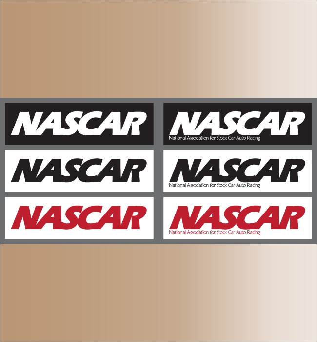
And the next cool stuff, which is really cool, is re-designing some very popular logos. From the given list I chose NASCAR and GREENPEACE logos. The rule is, we can use just typefaces, not anything else. That was really challenging, because it is not just changing the font features or colors. Why we chose that style, why we chose that color, why, why, why? Here we start.
NASCAR
The most popular car racing sports of the country. Haven’t you heard about it? But probably you have heard about the Lightning McQueen from the movie series of “The Cars” if you have a boy. In the movie, the big event is the Piston Cup. NASCAR is a kind of the real life version of Piston Cup. So, my new logo is here. So, my new NASCAR logo is here. Next, I am going to explain the WHYs.
First things first, the typeface. This is a very popular sports and the cars are kind of technological toys, so I tried to find some modern style, good standing typeface with clean lines, instead of an old time style or decorative one. My typeface is Eras Bold ITC from Adobe Illustrator. By using ‘Stroke Tool’ I tried to make it to be more powerful. To express the speed and the action in this sports, by using Shear Tool, I made the logo to be tilt to the right direction with an angle of 25 degrees. Also, to express the racing environment- the cars are mostly very close to each other in a tight race conditions- by using Tracking Tool, I ,made the letters close enough to touch each other. In case of some official use needs, I also add a version containing the full name of the association just at the bottom of the logo. In that part, I have used a more classical style, which is Maiandra typeface. If the two typefaces were the same style, one might have reduced the effect of the other.
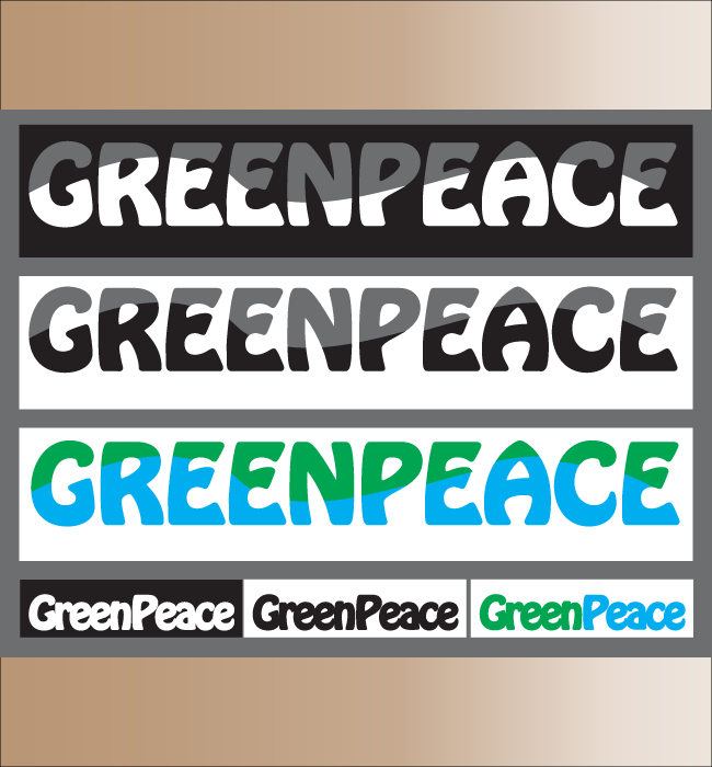
GREENPEACE
This is neither technology, nor classical history. This is just the nature, so the typeface should express the style of nature, not very straight lines, mostly smooth edges or non-geometric shapes. So, my typeface is Hobo STD Medium.
To increase the express, I used Stroke here too. Because the nature is always powerful, like a deep green forest or a big wave in an ocean. Since the name of Greenpeace actually consists of two words, I tried to express this feature a bit more than it was in the original logo. So I made the ‘G’ and ‘P’ capital letters but did not use a space between two words to do that slightly. And finally, the nature’s major colors are green for the forests and blues for the oceans, that is why I used these two colors on my logo design. In one version I just tried to give some wave form to differentiate the two colors.
In both two logo designs, to observe how they look like in a grayscale printout, I added B&W versions. Thank you for reading, have a happy, colorful and exciting life.
Bulent
Comment (0)